During COAST's trade shows, catalogues were handed out that contained information about the show and the exhibitors. I designed the covers of some of these catalogues, based on their branding style. There would always be a black & white photo related to the location of the trade show, with the logo in blue.
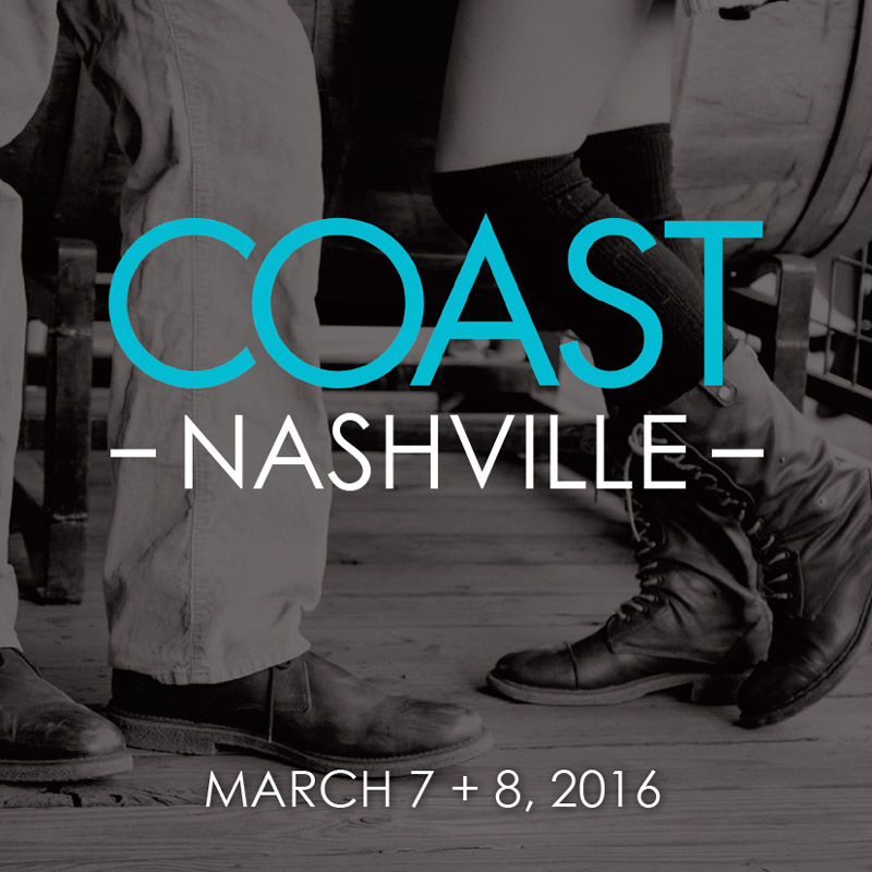
Catalogue cover - Nashville trade show

Catalogue cover - Miami trade show
I designed a few different cards that would be handed out at the trade shows. They would promote all the hashtags that were being used on social media platforms during the trade show.
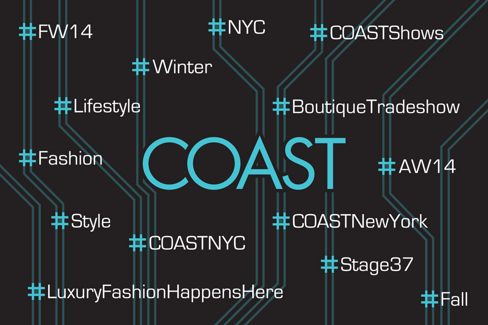
For the New York trade show, I took inspiration from the maps of the NY subway system to connect the different hashtags. The hashtags would represent stops on the track system as a way to tie it to the show location in New York City.
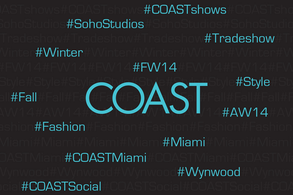
For the Miami trade show, I filled the card with repeating hashtags on each line. Then highlighted one per row in COAST blue, while the others were faded. This gave it some texture, while still hightlighting the necessary information.
COAST would sometimes promote its upcoming shows in fashion industry magazines. I created a few ads that were used to advertise the trade shows in those magazines.

For this ad, the client wanted something simple that gave the feeling of the ocean. So I set up the layout first, then created the background image to work with the text.
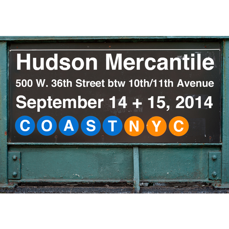
I created this ad for a NY trade show. I manipulated the photo of the subway train station entrance into one with the COAST name and trade show information.